A Senior Mode testers called “easier than the current POSB app”.
Senior Mode is a concept for POSB digibank that turns the everyday app into a calm, guided, one-task-per-screen experience for Singapore's fast-growing senior population. It's built around how older users actually learn interfaces.
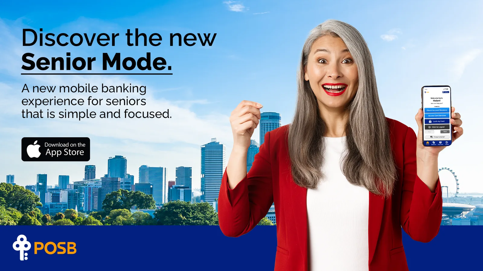
Banking apps are built for the young. POSB's existing "Simple Mode" is hidden under "Smart Shortcuts" and barely changes the experience, so seniors still lean on family to check their own money.
I designed every screen of Senior Mode from scratch, on a design system I built from POSB's own brand guidelines. I mapped the mental models seniors bank with, designed around them, and tested them in people's homes.
A high-fidelity prototype tested at home with 5 users aged 45–60, plus a launch campaign and a plan to measure success after launch.
"How might we help seniors bank on their own with confidence, by matching the mental models they already trust instead of asking them to learn new ones?"
01 · The opportunity
Seniors weren’t afraid of the app. They were afraid of losing their money in it.
Help seniors bank on their own, without calling family every time.
When I want to check my money, I want to see it the way my passbook shows it, so I can trust nothing changed without me.
- A digital passbook with Next, not scrolling
- Four fixed actions on one home screen
When I send money, I want one step at a time, so I don’t press the wrong thing and lose it.
- One task per screen
- A confirmation before anything changes
- Raised buttons that look pressable
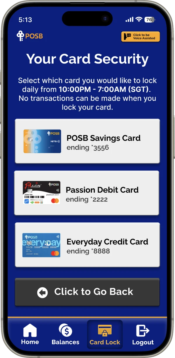
When I worry about scams, I want to lock my cards while I sleep, so I can rest easy.
- Card lock from 10 PM to 7 AM
- Voice Assist and four languages for low vision and second-language users
What I left out: the “Banking Together” family mode. It came out of the same research, but MoSCoW put it after the core tasks, so it’s first on the roadmap.
Jobs framed from our research. Each arrow is a bet we designed.
02 · The problem
Seniors aren't afraid of learning technology. They're afraid of losing their money while they learn it.
Singapore will have around 900,000 residents aged 65 and above by 2030, and more of them are banking online every year. Yet digital banking is designed for tech-savvy users. Many seniors rely on children to update their passbook or check a balance, and age-related changes in vision, hearing, memory and dexterity make dense apps hard to use and scams harder to spot.
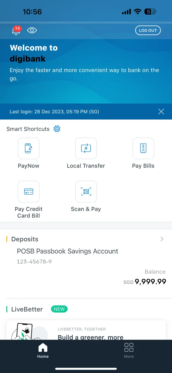
Hidden behind "Smart Shortcuts". It only removes items. Layout, density and wording stay the same, so the experience barely changes.
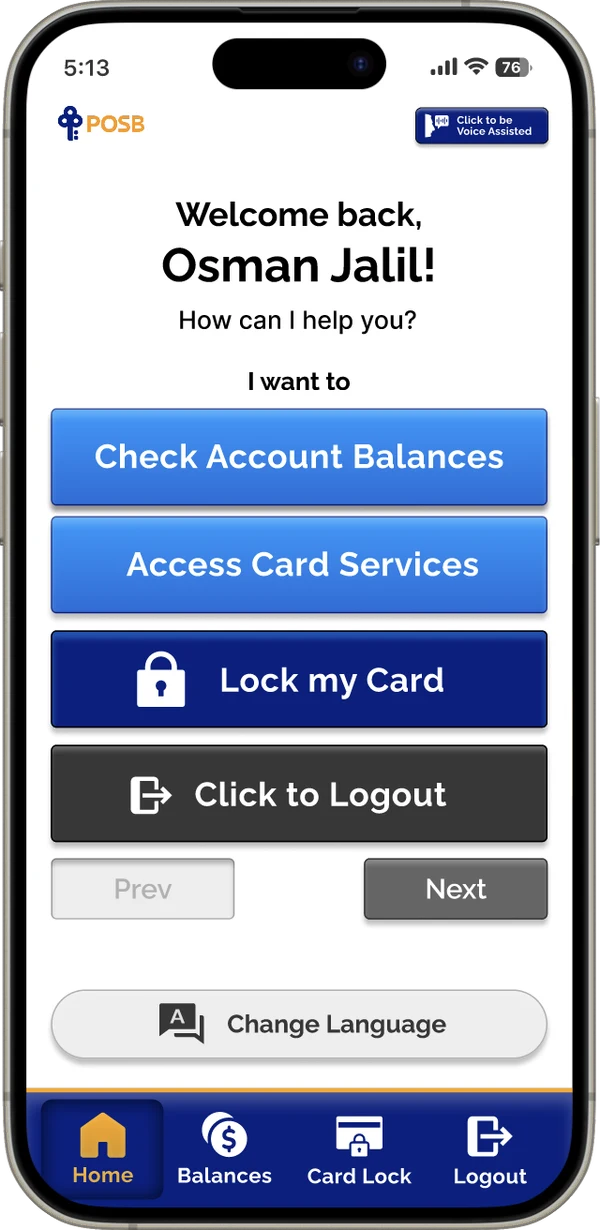
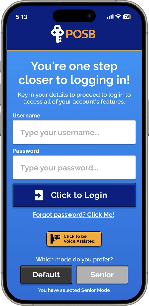
Chosen at login, not buried. One greeting, one question ("I want to…") and four large, labelled actions. Nothing to scroll, nothing hidden.
03 · Research
We looked at the market, the people and POSB itself before drawing a single screen.
Benchmarked senior-focused finance products like Charlie, City Savings Bank and Trust Bank for patterns in simplicity, security and voice control.
Built with a lean survey canvas. Top tasks: deposits, withdrawals and transfers. 82% bank at least weekly.
Adult children who act as "tech support" for their parents. They see seniors struggle every week.
Inventoried the app, ATMs, teller screens and the physical passbook, and scored readability with the Flesch test.
Navigation is learned by position, not discovered. Any change sends them into "panic mode", and scrolling hides things they've memorised.
Every screen has to signal trust and safety, and confirm before anything changes.
Help from family or a teller feels safer than any tooltip, so the app has to guide like a person would.
Banking jargon in a second language doubles the effort of every task.
"Match the mental model seniors already have, instead of asking them to build a new one."
04 · From scope to screens
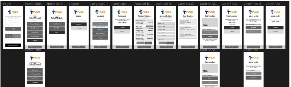
We turned research into a value proposition canvas and two feature hypotheses, ranked ideas with MoSCoW, then card-sorted a stripped-back site map: one home screen, four features, nothing nested more than one level deep. Lo-fi wireframes tested the flow before any visual design.
05 · The design system
I built Senior Mode on POSB's own brand, then rebuilt every component around how seniors think.
Starting from POSB's existing guidelines kept it unmistakably POSB, and familiar to the seniors who already trust it. On top of that I defined an accessible component set where every rule traces back to a mental model from our research.
POSB's brand typeface, kept for recognition. Every action label is set at a minimum of 24 px.
Design decisions
Because seniors memorise position, every action is visible at first glance and stays in the same place. Buttons are 357 × 70 px with 24 px labels.
Why skeuomorphic, on purpose. Flat design is the modern default, but research shows older adults are drawn to skeuomorphic elements because they read as touchable. Raised buttons that visibly sink, click and buzz behave like the ATM keys seniors already trust, and they won in home testing.
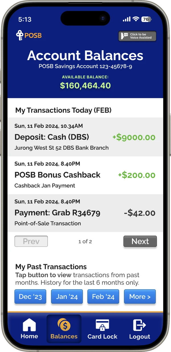
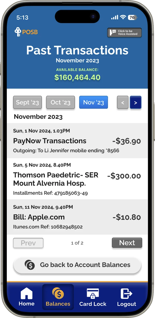
Checking balances is the task seniors do most, and the passbook is the format they trust. The balance sits in a high-contrast header, deposits are marked in green, and transactions come in fixed pages with Prev / Next and month buttons, so nothing disappears off-screen.
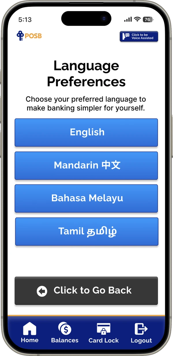
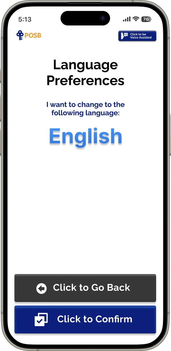
Users can switch between Singapore's four official languages, with a confirmation screen that states exactly what will change. A Voice Assist button on every screen reads instructions aloud in the chosen language for users with low vision.
Scams are seniors' biggest fear. Card Security lets them lock any POSB card daily from 10 PM to 7 AM, when most fraud goes unnoticed. Cards are shown as large, recognisable buttons with their image and last four digits.
06 · What had to be true
Three bets the whole design leaned on, checked in people’s homes.
Seniors trust raised, touchable buttons more than flat modern ones.
Home sessions with 5 participants on real tasks.
Held
Raised buttons helped people see and tap targets accurately.
A fixed layout makes the second visit faster than the first.
Repeat tasks in the same sessions.
Held
People memorised positions, and repeat tasks got easier.
It works for people 65 and over.
Not yet. Our testers were 45 to 60.
Not tested yet
First thing to test next, including seniors without family nearby.
07 · Testing at home
I took the prototype to where people actually bank: their living rooms.
Testing at home, on a phone, with family nearby kept sessions relaxed and honest. No lab, no pressure to perform. My participants were my former boss (60), my parents, and a teammate's parents, aged 45–60. I wasn't just checking usability; I was checking whether the mental models I'd designed around held up in real hands.
"This looks easier than the current POSB app."
A tested prototype, and a campaign ready to launch it.
09 · How we’ll know it works
The two metrics I’d hold the launch to, plus what would prove the outcome.
Completion rate for checking transaction history, six months after launch
Share of Senior Mode users who turn on Voice Assist
Share of seniors who pick Senior Mode at login
Fewer seniors saying they need family to do basic banking (follow-up survey)
A tested high-fidelity prototype and a launch campaign.
Test with users aged 65 and over, and with seniors who live alone.
Build “Banking Together”, so family can help without taking over.
10 · What I learned
Designing for seniors is designing for psychology as much as for eyesight. Respecting existing mental models beats inventing better ones.
Familiar beats fashionable. Choosing skeuomorphic buttons over the flat-design default was a deliberate call, and home testing backed it. For this audience, looking touchable matters more than looking modern.