Four languages, eight markets, one system to hold them.
Aboitiz Foods is the Aboitiz Group's new food and agribusiness subsidiary. It brings Pilmico, Gold Coin and the group's other producer brands together under one name and a new CEO. As a leading backer of agricultural growth across Asia-Pacific and one of the region's biggest feed exporters, it needed a group website that put every brand under one roof and told the whole mill-to-meal value chain in English, Bahasa Indonesia, Vietnamese and Simplified Chinese. I took it end to end: the brand strategy and visual system, the information architecture, the content, and four rounds of UAT with Kvy, the development team in Vietnam.
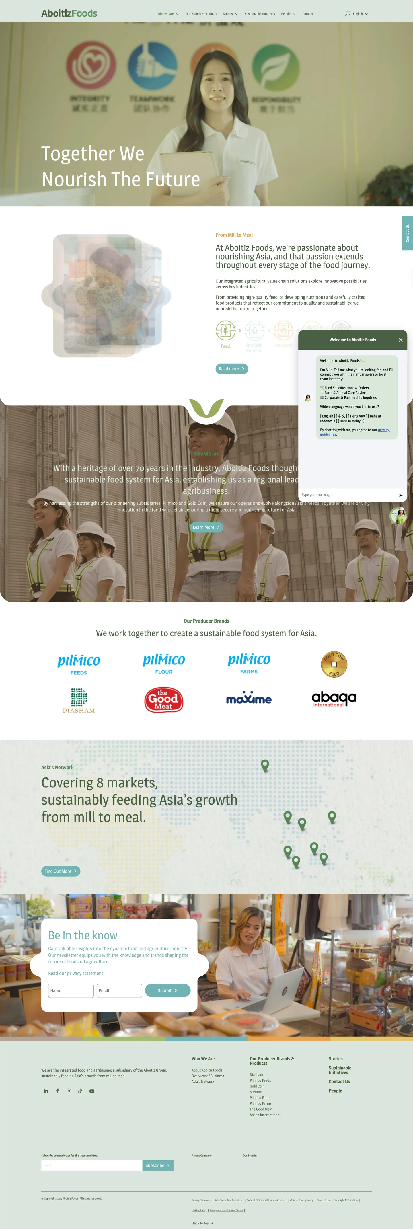
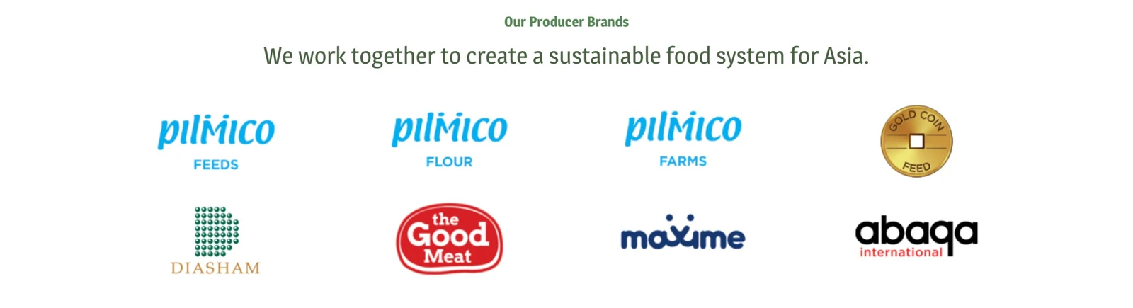
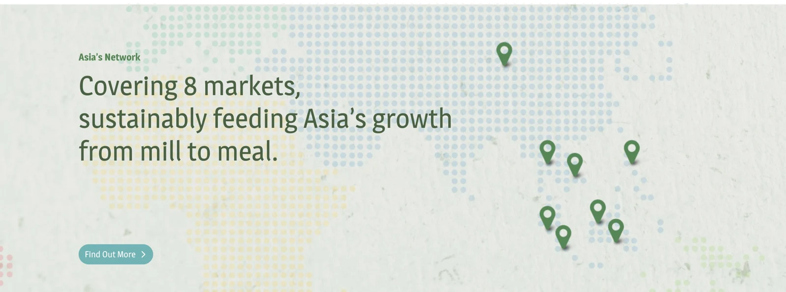
A brand-new group bringing long-established brands under one name. Five businesses, eight brands, eight markets and four languages, all on one website.
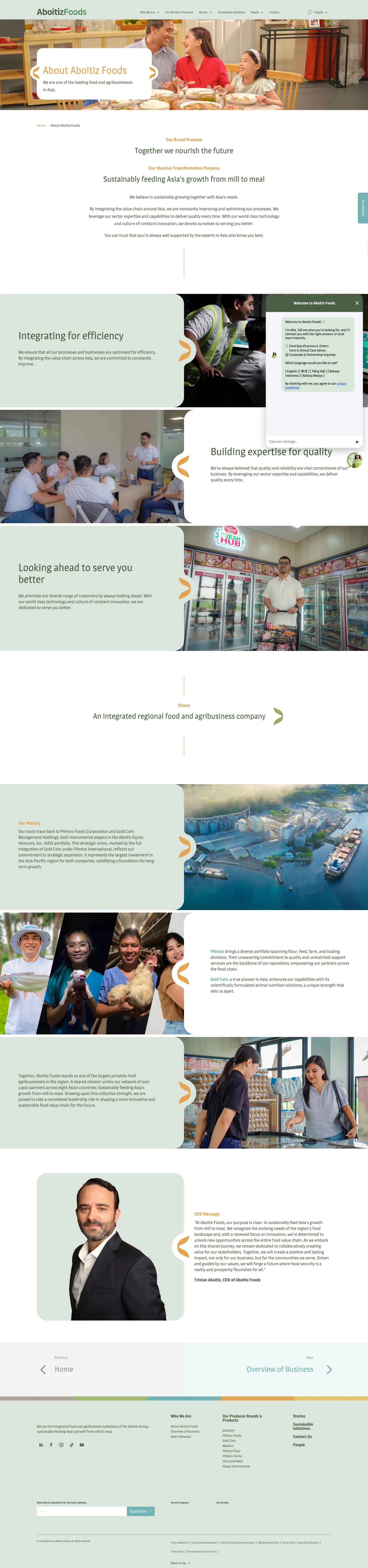
A visual system built to hold anything. One shape frames image and text alike, and one colour strip runs through every menu, so any page in any language is built from the same parts.
IA and content in one workroom, weekly check-ins with Kvy, four rounds of UAT, plug-ins and a careers API.
Live in four languages. In the client’s words, I’m “truly a master of her craft”.
"How might we introduce a brand-new group that brings every brand under one roof, across five businesses, eight markets and four languages, without any page drifting off the mill-to-meal story?"
01 · The opportunity
A new name that partners, customers and job seekers had never heard of.
Introduce a brand-new group so people understand what it does and know which brand to talk to.
When I first hear about Aboitiz Foods, I want to see what it does from mill to meal, so I can tell if it’s the right partner.
- The mill-to-meal story on the homepage
- One shape and one colour strip holding every page together
When I’m looking for a specific product, I want to find the right brand quickly, so I can get to its own site.
- One hub for all eight producer brands
- Side menu on desktop, swipeable tabs on mobile
When I’m looking for work in my country, I want open roles in my language, so I can apply without emailing anyone.
- Four languages across the whole site
- Careers pulled in by API, filterable by country
Jobs framed from our research. Each arrow is a bet we designed and shipped.
02 · The challenge
A brand-new group, eight established brands, and one website to bring them together.
03 · IA & the content workroom
One place where every page was structured, written, translated and checked before it was built.
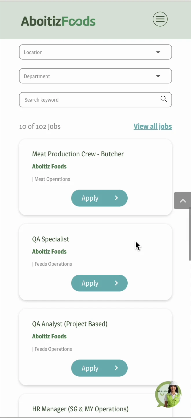
04 · Shipping with Kvy
Four rounds of testing, every week in contact, until it was right.
A long list of issues, logged, sent back and re-checked round after round, so they were caught before launch.
Design decisions
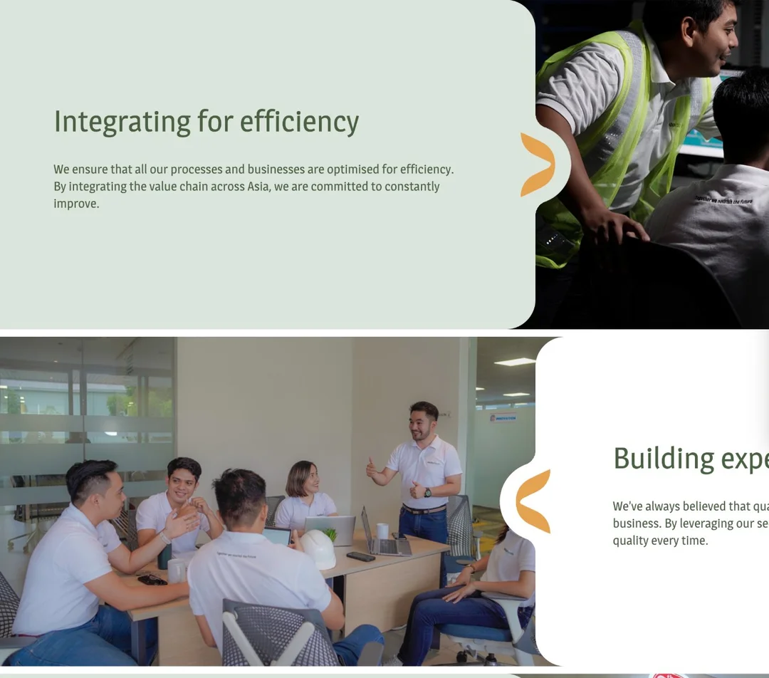
Every block sits in the same rounded panel, joined to its photo by a notch that carries the brand's chevron. Because one shape holds words and pictures the same way, every page is built from the same part, whatever the language and whichever brand it's for.
The five-colour strip runs inside the dropdown menus and above every footer. Its colours are the five links of Aboitiz Foods' agricultural value chain, from mill to meal. So every menu quietly retells the group's story, and the navigation feels like part of the brand.
A four-language corporate site, live and still growing.
“I recall her providing sound recommendations based on brand positioning—exemplifying strategic as much as technical expertise. Jolin is easy to work with and truly a master of her craft.”
06 · How we’ll know it works
What I’d watch now that the site is live.
Clicks from the brands hub out to each brand’s site
Visits by language, to check all four are pulling their weight
Careers searches and filters used
Job applications started from the careers page
Partner and customer enquiries through Contact
Live in four languages after four rounds of UAT with Kvy.
Track where visitors drop off between the brands hub and the brand sites.
Bring each brand site closer to the group’s visual system, so the hand-off feels like one family.
07 · What I learned
Content is UX. On a site this broad, how words are organised, written and checked decides whether anyone finds what they came for.