Members couldn't tell what was theirs, so I gave “yours” one colour.
Absolute is Asia's largest boutique fitness studio, with 15 studios across Singapore and Bangkok and more than 100,000 members. Its app store reviews kept circling one frustration: members couldn't see what they'd booked or be sure which slot they'd picked. As facilitator and Scrum Master, I led the audit and the new booking flow, and designed the full design system around one rule: pink only ever means “this is yours”.
Reserve the brand pink for one meaning, “this is yours”: your selected class, your time slot, your seat. Everything else stays black, white and grey.
A fitness brand would normally splash its signature colour everywhere. I gave that up, so on any screen a member's eye lands on their own booking first.
Three recurring app-store complaints and a heuristic evaluation pointed to the same gap: the old app never showed members where they stood.
This was a school project without usability testing. The outcome below says what I'd test, and how I'd measure it.
"How might we enable users to easily access and view the classes they have booked, with clarity about their upcoming fitness appointments?"
01 · The opportunity
Every complaint came back to one thing: members couldn’t see where they stood.
Members book the right class first time, and always know what they’ve booked.
When I open the app, I want to see what I’ve booked, so I can plan my week without screenshots.
- Pink only ever means “yours”
- Current bookings one tap from Profile (moving to Home next)
When I pick a class, I want time and length first, so I don’t book the wrong slot.
- Time-first class cards
- Your selection lights up in pink
When I choose a seat, I want to see what’s free and tap it easily, so I get my usual spot.
- A tappable seat map with a legend
- Row and seat pickers as a backup
What I left out: pink as decoration, and the payment and check-in flows. Fixing booking came first.
Jobs framed from app store reviews and our heuristic evaluation. Each arrow is a bet we designed.
02 · The problem
Three complaints, one root cause: the app never showed members where they stood.
We started with what members were already saying in app store reviews. Three complaints came up again and again, and each one is really about status: what's booked, what's possible, what's mine.
03 · Research
Who books, and where the app gets in their way.
Wants a regular workout routine across different classes. Gets stuck on long, fiddly booking steps, then finds his favourite classes already full.
"I want a user-friendly navigation system so that I can effortlessly explore and view available classes."
04 · A new user flow
One straight path to a seat, with a detour only when you need a plan.
"Current bookings" sits one tap from the profile. Looking back, that's one tap too many for the most common complaint. Next time, your upcoming class would live on Home, marked in pink.
05 · Design principles
Three words to judge every screen against.
Familiar booking patterns and a clutter-free interface. No cryptic menus, no endless options.
A visual language that feels as premium as the studios: dark, photographic, high-performance.
Reminders, progress cues and easy scheduling that keep members coming back.
06 · The system
One pink, one meaning: “this is yours”.
I designed the whole system: colour scales, type, grid, icons and every component. The rule that matters most is the colour rule: pink is never decoration. It marks your selection, your time and your seat, so members can find what's theirs on any screen without reading.
A 14-step pink scale, main at #FF2F66. On a black UI, pink only ever means "this is yours": your selection, your time, your seat.
A Google Font, so it's web-safe and covers 200+ languages.
8-column grid with 16px gutters on a 430 × 932 iPhone Pro Max frame, exported at 3×.
Before → after
Current app on the left, redesign on the right. Each change is a choice, and I've noted what I chose it over.
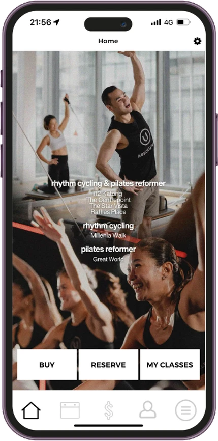
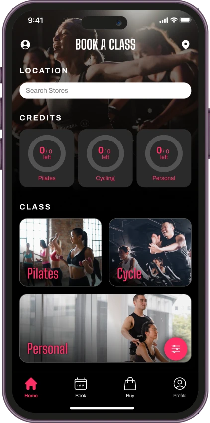
- Why: the old list was cut off and repeated classes by category, which failed on flexibility & efficiency.
- Classes regrouped into three big cards: Pilates, Cycle, Personal.
- Search by outlet to book at the studio you want.
- Rings show how many credits you have left, per class type.
- Filter and sort live behind one button, so the screen stays clean.
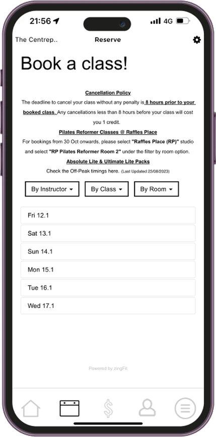
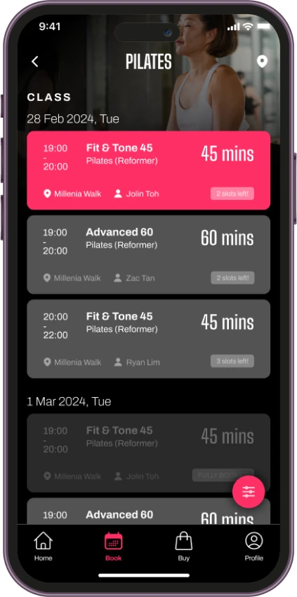
- Why: members worried about booking the wrong slot, so time and length now lead each card instead of the class name.
- Your selection lights up in the brand pink.
- Location, instructor and "slots left" sit on every card; full classes fade back.
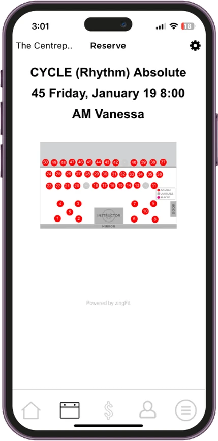
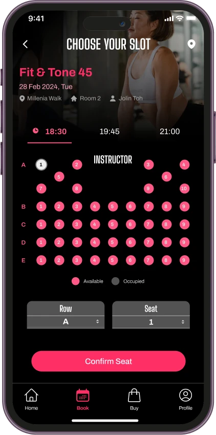
- A legend shows available and occupied seats at a glance.
- Bigger seats for touch, plus row and seat pickers as a backup.
- Time tabs let you try other slots without leaving the page.
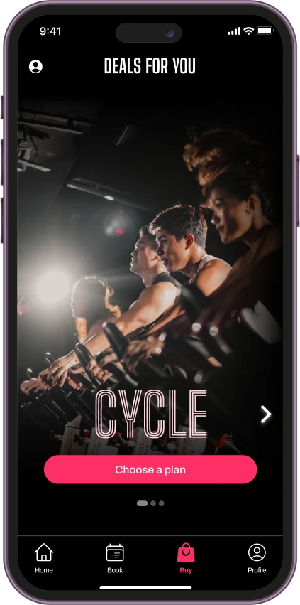
- Out of credits? A short clip of the class plays before you pick a plan, to motivate you to sign up.
- Swipe between Cycle, Pilates and Personal, each with one clear "Choose a plan" button.
- Trade-off: a clip can feel like a sales pitch to members who just want to rebook. That's why this is the first screen I'd put in front of users.
07 · What had to be true
Nothing here is tested yet, so these are the riskiest bets, in the order I’d test them.
One colour rule is enough for members to spot what’s theirs.
A five-second test on the schedule and seat screens.
Not tested yet
If people miss it, add a label, not more colour.
A class clip before prices motivates rather than annoys.
A/B test: clip first versus plan list first.
Not tested yet
Watch plan sign-ups and how fast people skip.
Members look for their bookings in Profile.
Card sort or first-click test with five members.
Likely false
I expect Home to win, which is why it’s next on the roadmap.
08 · How we’ll know it works
What would tell us the redesign did its job.
Time to find your next booked class
Booking completion rate
Fewer app store reviews about missing or failed bookings
Fewer wrong-slot cancellations
A full design system and the booking journey in high fidelity.
Test the three riskiest bets with five members, and move your next class onto Home.
Carry the system into payments and check-in.
09 · What I learned
A design system pays for itself: once the design language is defined, every new screen follows it without re-deciding the basics.