One app, two kinds of hero: designing myResponder for the Newbie and the Dabbler.
myResponder is SCDF's app that alerts trained volunteers to cardiac arrests and fires nearby. In a five-day sprint we found that responders split into two groups: Newbies, trained but unsure of their first case, and Dabblers, experienced and impatient with clutter. The redesign had to welcome one without slowing down the other.
Too few responders accept alerts. Newbies hesitate because they don't know what's expected; Dabblers drift away because the app gets in their way.
Ran a five-day sprint and designed one flow from Singpass sign-up to CPR, with confidence-builders for Newbies and a faster, cleaner path for Dabblers.
Tested with 2 Newbies and 3 Dabblers, then refined: roles before chat for one, less clutter and a clearer map for the other.
"How might we improve responders' experience and engagement, so more of them accept alerts and take part?"
Long-term goal: boost engagement and improve cardiac arrest outcomes by 20% within two years.
01 · The opportunity
Same training, different confidence. The tree split in two.
More trained responders accept alerts, and act with confidence when they arrive.
When an alert comes in for my first case, I want to know what’s expected of me, so I go instead of freezing.
- A roles page before the chat
- A mentor before the first case
- Courses and progress on Home
When I accept an alert, I want the route, the AED and my role in seconds, so I can get there fast.
- The route shown on the alert itself
- One map for casualty or AED
When I arrive, I want people to trust that I’m certified, so I can take charge.
- Singpass sign-up that pulls in CPR and AED credentials
What I left out: paramedic tracking, the status toggle and a “lives saved” counter. Testing showed they distracted responders, and outcomes aren’t always good news.
Jobs framed from our sprint interviews. Each arrow is a bet we designed.
02 · The problem
Every minute without CPR lowers the chance of survival. The app has to turn an alert into action, fast.
We mapped the whole emergency, from the witness calling 995 to paramedics arriving, and spoke with an active responder and one of the app's founders at SCDF. Four problems kept coming up:
Who we designed for
Every responder is trained. What splits them is experience, and that changes what they need from the app.
Certified, often through National Service, but has never answered an alert in the app.
"Ready to click 'accept' when help is genuinely needed."
Has responded before, sometimes with SCDF or grassroots experience, and accepts an alert without thinking.
"The focus should be saving lives, not socialising."
Five interviews, so treat this as directional, not statistical. Names and segments from our sprint write-up.
03 · The sprint
Five days, from a blank wall to a tested prototype.
04 · The journey
Four screens from "someone needs help" to "I'm doing CPR".
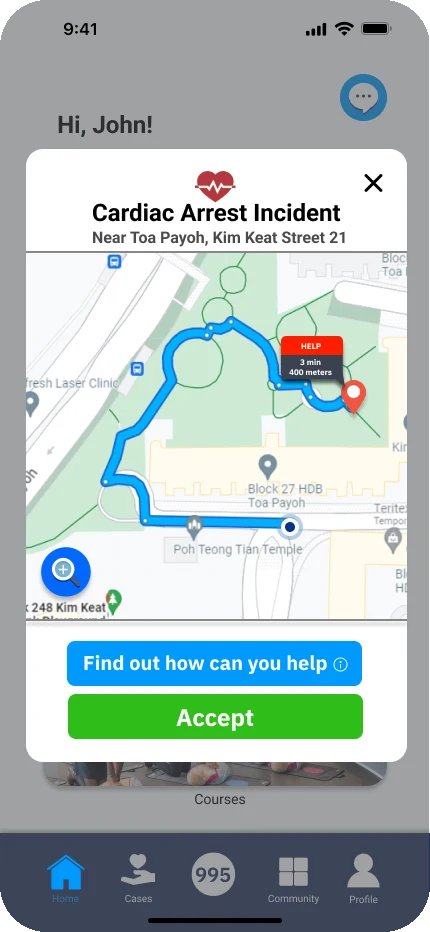 01 · AlertSee it, then acceptThe alert opens with the route already drawn, so the decision to go is instant.
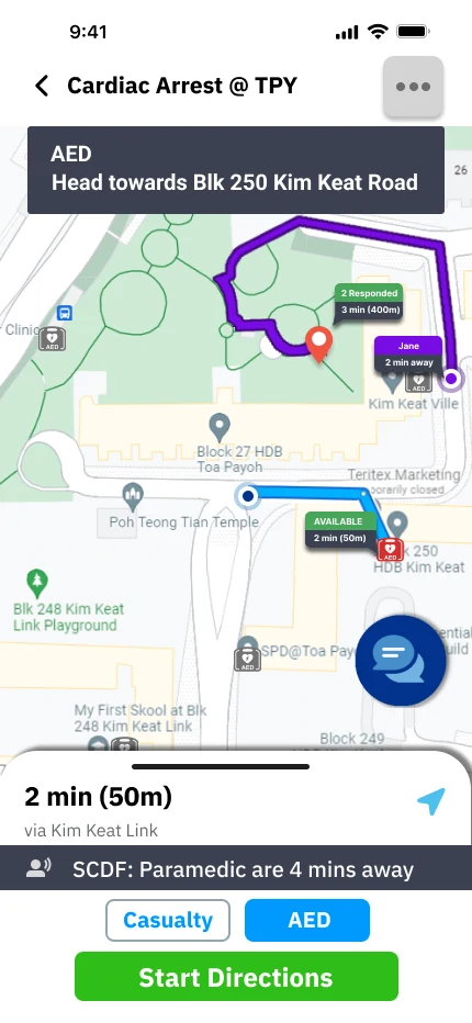
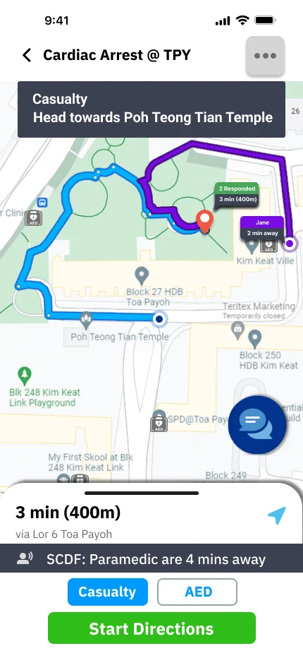 02 · NavigateOne live mapYour route, other responders' routes in colour, and nearby AEDs on one screen.
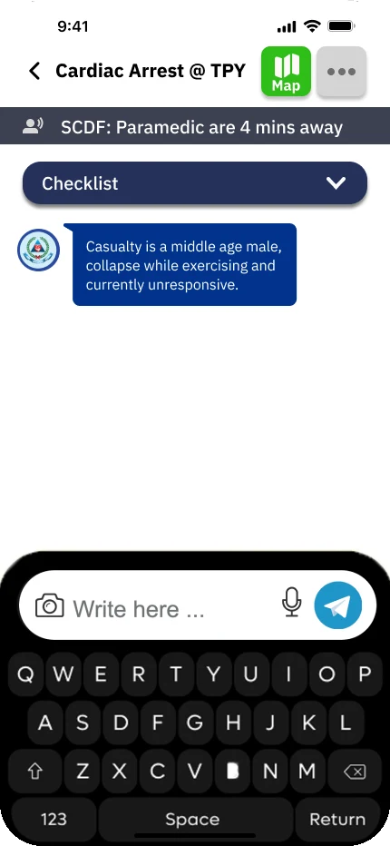 03 · CoordinateSplit the rolesAn auto-generated checklist in the case chat: grab the AED, do CPR, control the crowd.
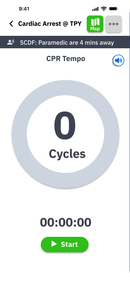 04 · ActKeep the rhythmA CPR metronome counts cycles and time with audio, hands-free.
Design decisions
An address alone makes people hesitate. The alert opens on a map with the walking route and distance ("3 min, 400 m"), so a volunteer can judge at a glance. Accept is green, the colour we gave every positive action, with "Find out how you can help" for anyone unsure.
Responders either go to the casualty or fetch an AED. One toggle switches the route, nearby AEDs show if they're available, and other responders' routes appear in colour ("Jane, 2 min away") so nobody doubles up.
Unclear roles were a core problem, so each case gets a chat with SCDF's casualty update and an auto-generated checklist: grab the AED, perform CPR, crowd control. Once compressions start, the CPR tempo screen keeps count with audio, so hands and eyes stay on the casualty.
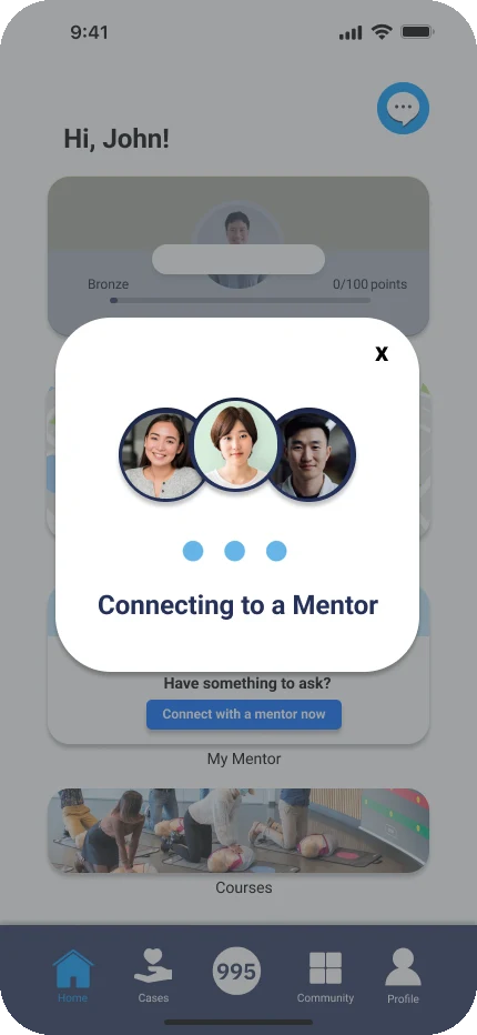
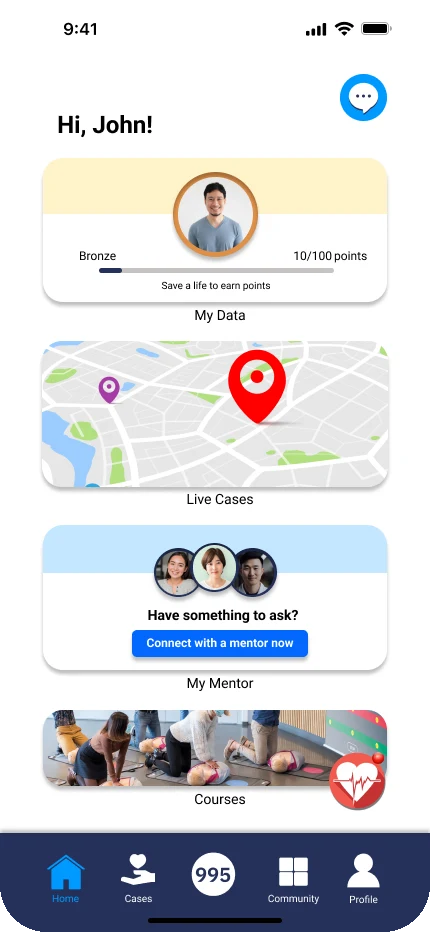
Signing up with Singpass pulls in CPR and AED credentials, answering the public's doubts about who's really certified. Testers found it familiar and quick. New responders can message an experienced mentor before their first case, with courses and progress kept on the home screen.
05 · What had to be true
What we needed to learn on day five, before anyone wrote code.
Newbies hold back because they don’t know their role.
Expert interviews, then 5 prototype tests.
Held
Unclear roles came up again and again, so a roles page now comes before the chat.
A mentor makes the first case less scary.
Prototype tests with 2 Newbies.
Mixed
Well received, but one tester doubted mentors would scale.
Singpass sign-up feels trustworthy, not like more admin.
Prototype tests with all 5.
Held
Testers found it familiar and quick.
06 · Testing
Five people, five honest reactions.
We tested with two Newbies and three Dabblers, including people with CPR/AED certification, SCDF experience, and healthcare and grassroots backgrounds. I wrote the eight-act interview guide and piloted it with a test user before the sessions.
07 · Iterations
After testing, every change took something away.
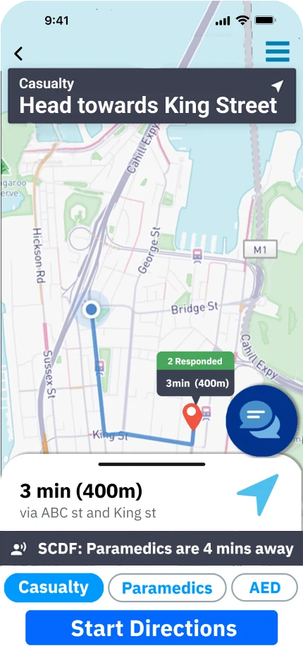
- Removed paramedic tracking and the status toggle. They distracted responders and encouraged waiting for paramedics. The ETA stays as a banner.
- Other responders now show as coloured routes, so you can see who's going where.
- The incident ("Cardiac Arrest @ TPY") became the screen title; positive actions turned green.
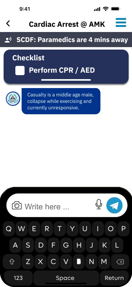
- A roles page now comes before the chat, so everyone knows their job first.
- The checklist collapsed into a dropdown, giving the conversation room.
- A one-tap Map button replaced the menu, and a Facebook community was added for peer support after cases.
08 · How we’ll know it works
Tied to the sprint’s long-term goal: 20% better engagement and cardiac arrest outcomes in two years.
Alert acceptance rate, split by Newbies and Dabblers
Time from alert to accept
Responders still active six months after their first case
Progress towards the 20% two-year goal
A tested 13-step prototype, refined after five interviews.
Test under stress, with a short casualty video before each session.
Make mentor matching work when responders outnumber mentors.
09 · What I learned
In an emergency app, every feature competes for attention. Staying focused on the core job (get there, know your role, do CPR) mattered more than anything we added.